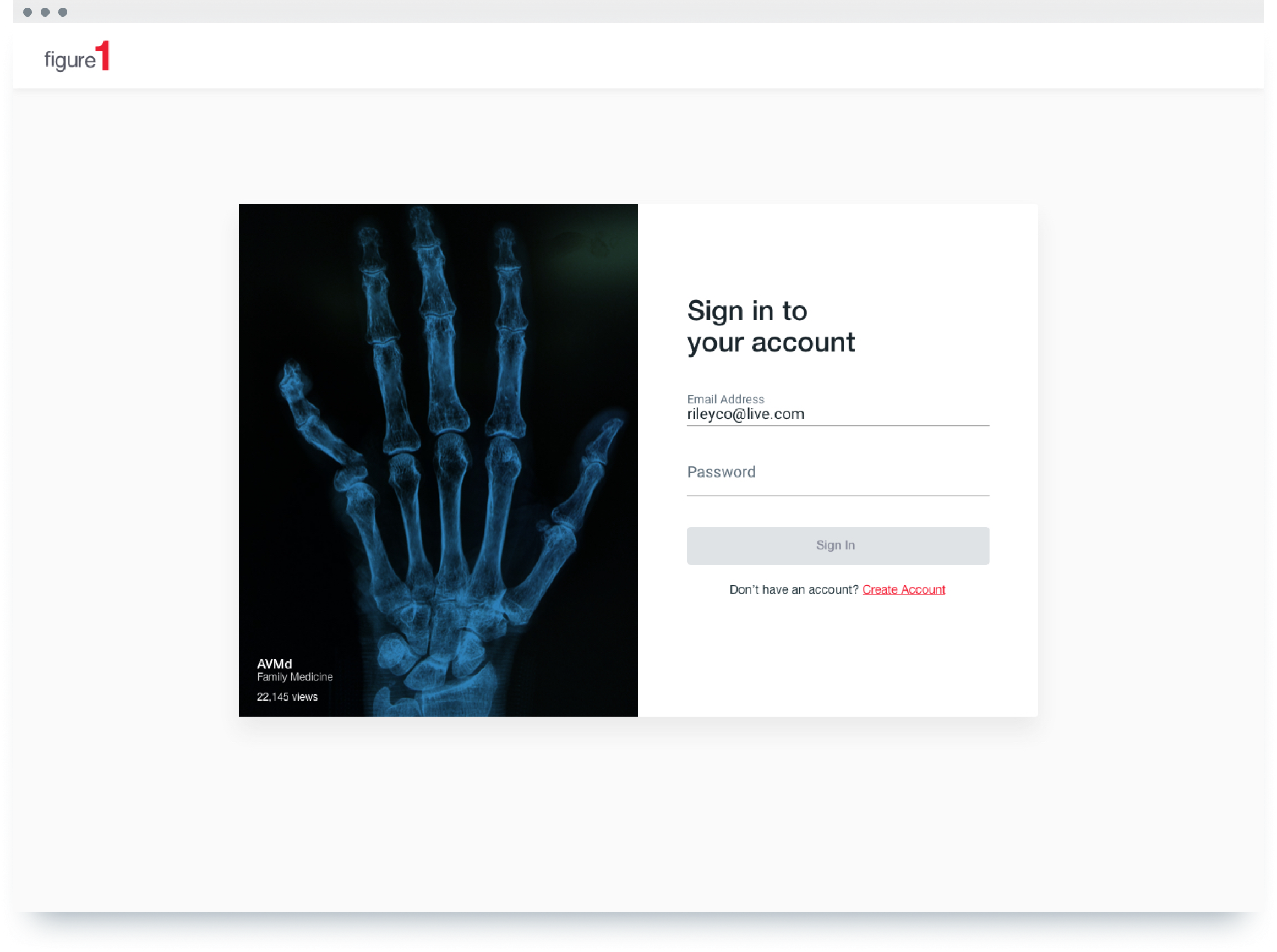
Figure 1's registration and login flow is a bit different when compared to most platforms. To maintain integrity in the healthcare space, we require all physicians to verify their license with our verification team.
On the experience side of things, this adds a lot more bulk and screens to our registration, which we then believed lead to drop off.
TEAM
PM: Phil L
UXR: Charlie H
Devs: Xiao M (iOS), Brandon L (Android), Catalin C (Web)
Designers: Me, Vanessa H

The original flow consisted of about 13 screens in total . Data on our metrics tool indicated that there were initial dropoofs on the first screen, after password creation and a particularily big drop off after the user had chosen a specialty.
Assumptions
Fourteen screens in the flow was ridiculous which we thought was the major reason we were getting so much drop off.
Implementing social login would help ease registration.
Notes from the original design stated that single form screens were more efficient, as it didn’t overwhelm users. However, as the flow got more complicated over time, we assumed that we’d have to have multiple forms per screen.
Data
Redash showed a steep drop off for physicians at the verification screen in particular. Before this screen hit though, there was also a initial drop off at the first screen when asked for an email address.
Physicians showed the highest amount of drop off compared to other healthcare professionals (nurses, students, etc).
Design
Constraints
Information architecture had to stay relatively similar to what we had now. New ideas like password-less logins were shut down due to lack of dev resources.
Learned that the verification part of the on boarding process (last 2-3 screens) were mandatory for all new physicians.
After looking at our assumptions, data and constraints. We came up with a few ideas via wireframes for the sake of speed and checking in with our stakeholders. Once approved, we turned them into rapid prototypes to test and put in
front of users.

• Idea 01
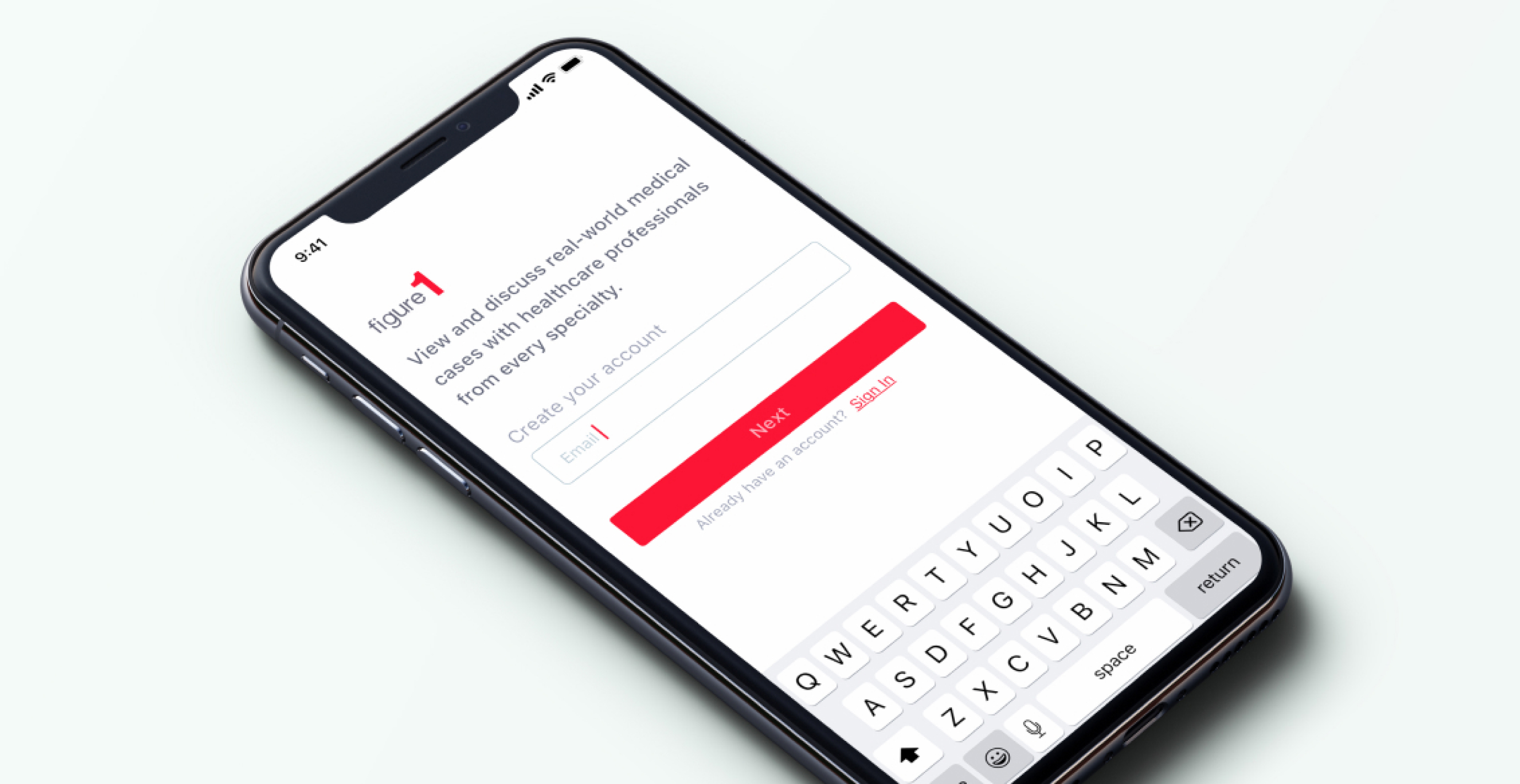
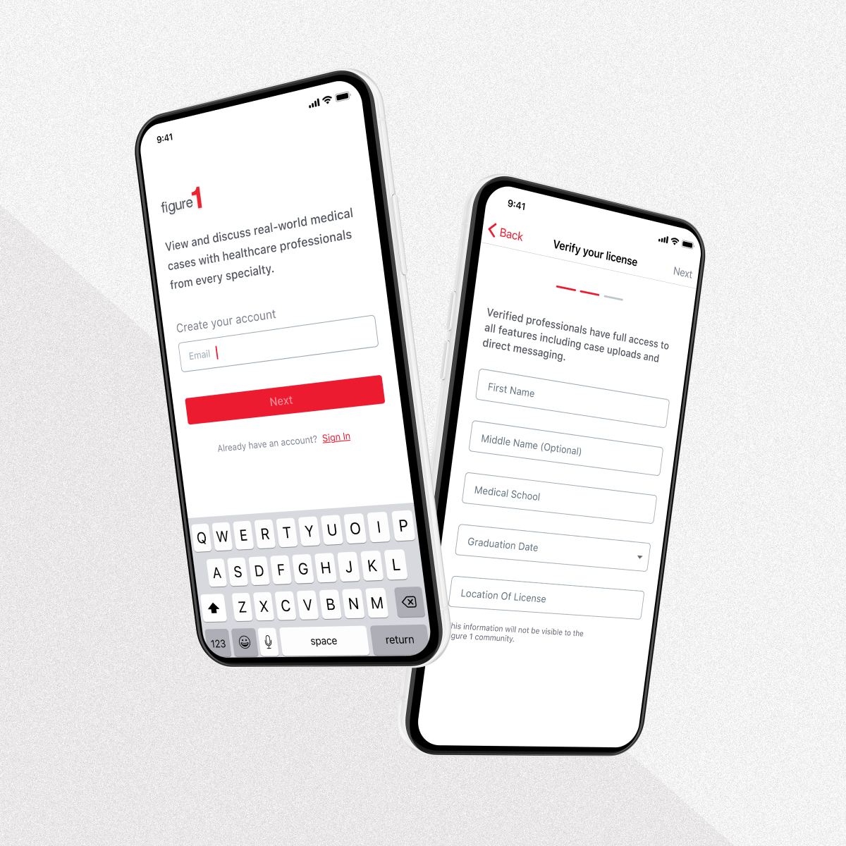
Having an initial splash screen with a real case in the background will tease users and increase their motivation to continue. Also, having a low friction single button will get users taking their first action.
Targeted towards our first initial drop off.
• Idea 02
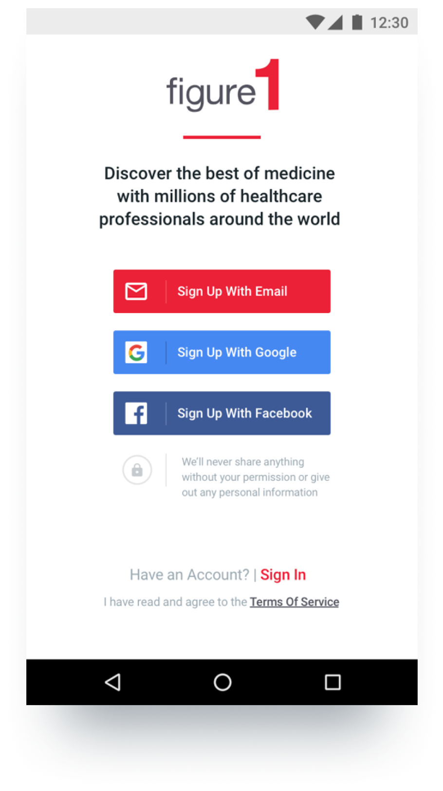
Having social login buttons would greatly speed up the flow for some users (Tested)
Results: Interviewed and user tested 8 physicians with a basic prototype and found out that many of them don’t use social media. The ones that do use LinkedIn, Twitter and sometimes Google.
• Idea 03
Having verification integrated as part of sign-up will increase the percentage of users who verify as it’s one of the first steps.
Also, having a narrative style of instructions will reduce confusion and increase users’ ability to understand and complete the flow. (Tested)
Results: Users who saw the narration based flow were more receptive to it and did seem to prefer it over the existing flow. Adjusting the copy to indicate how far the user was in the sign up process as well as adding navigation dots helped out as well.

After testing these prototypes based off some of our assumptions. We got into the production side of things and started to craft together an MVP and shipped it.
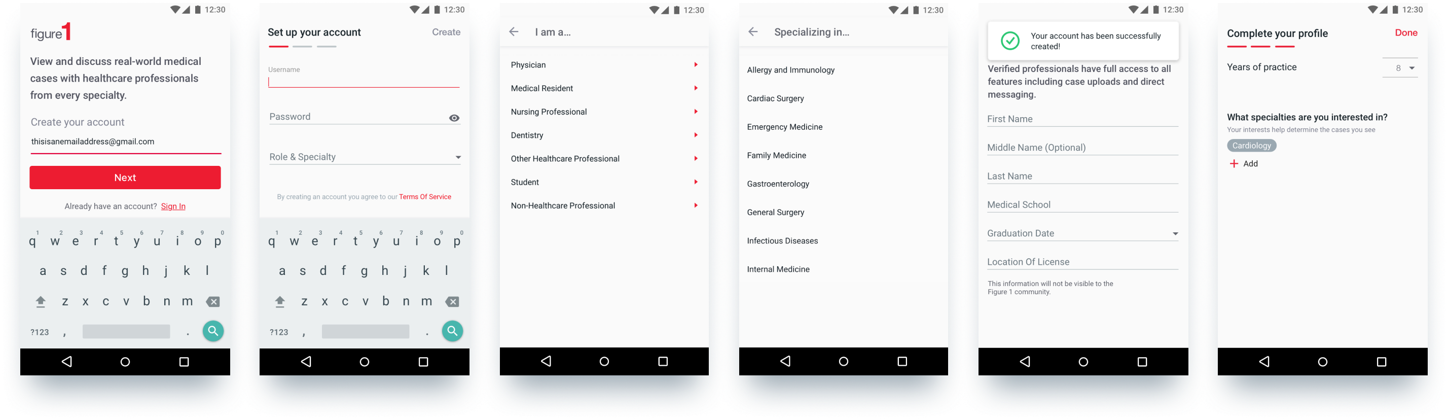
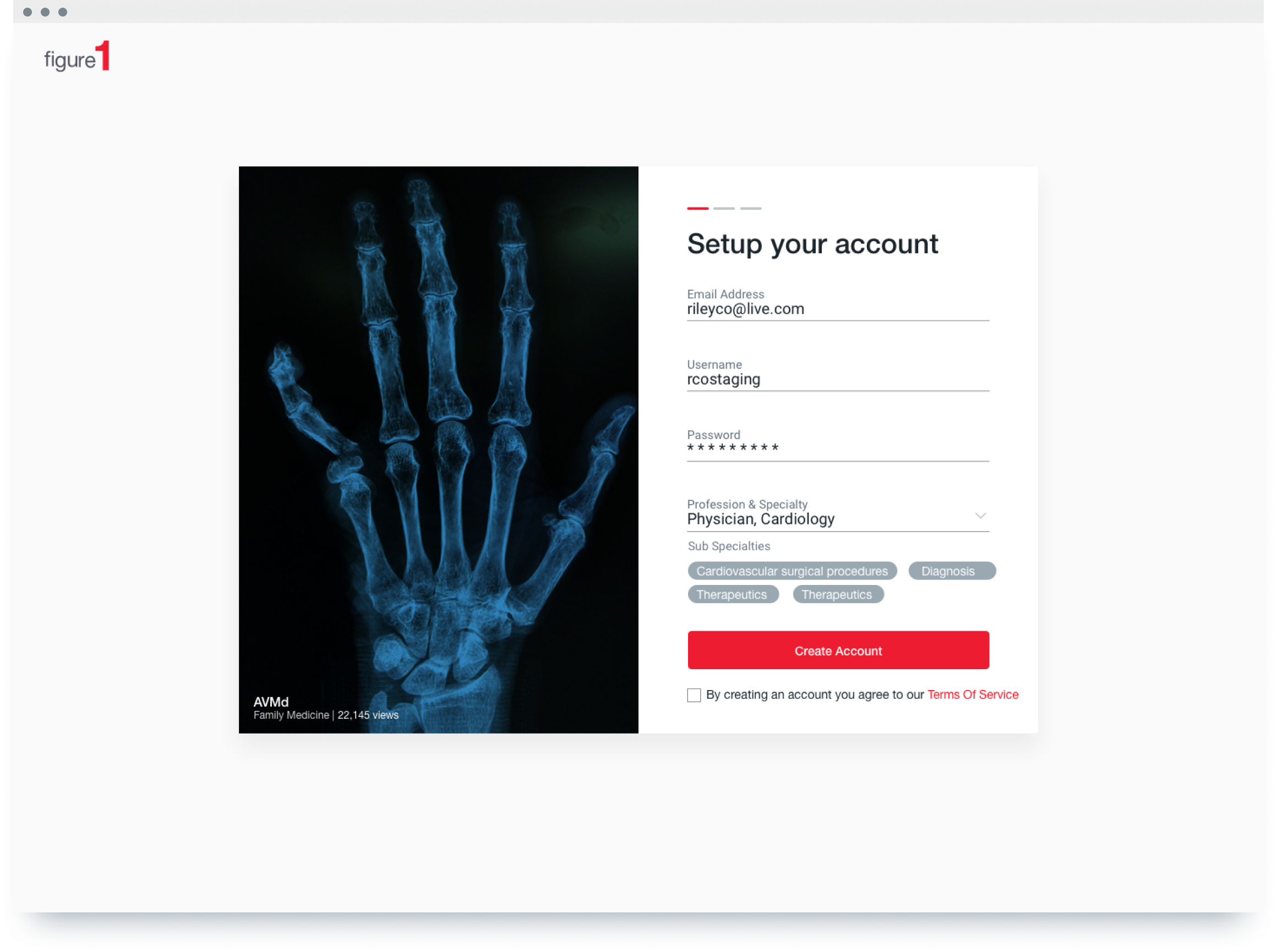
Reduced the number of screens by stacking forms and added narrative copy on the top nav bar. Replaced account creation screen with a toast and made verification one page. As of now, signups have increased by 10%.
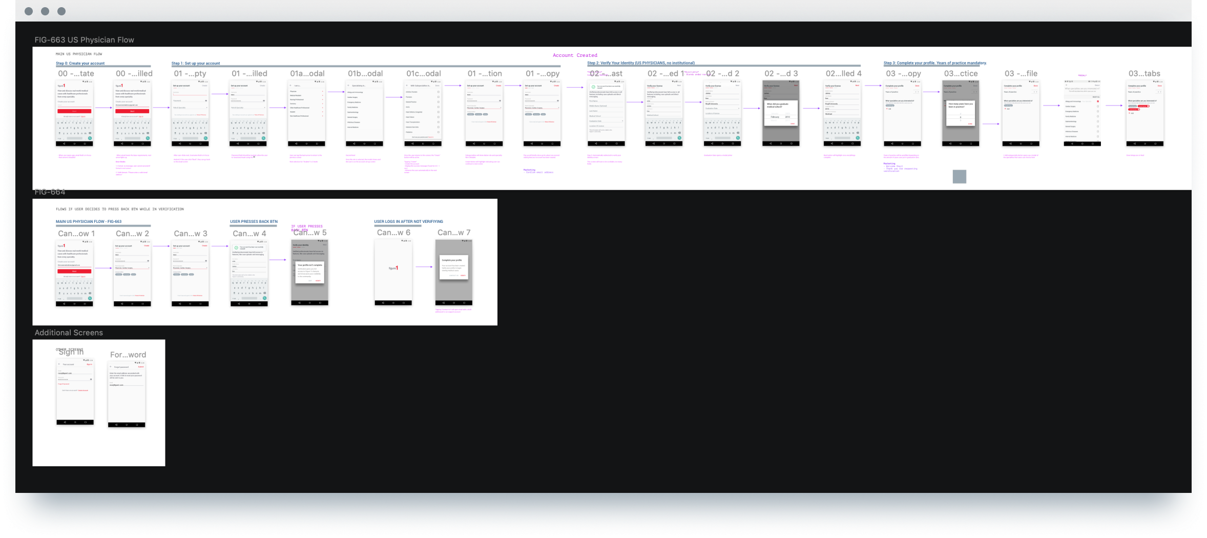
Overall the final hand-off file we sent to the dev looked more like this:
We were also required to update the registration flow of non-physician users (Nurses, students non-healthcare professionals, etc.)

Lastly, since we originally designed in android, we quickly mocked up an iOS version to share with the iOS developers.

Other Work
Registration FlowProduct Design

Quiz SeriesProduct Design
Redesigning SearchProduct Design

Grand RoundsProduct Design
FormatProject type

BackBoneWebsite & App

Movie AppApp Design