What is a "Grand Rounds"?
“Grand rounds are methodology of medical education and inpatient care, consisting of presenting the medical problems and treatment of a particular patient to an audience consisting of doctors, residents, and medical students. It was first conceived by clinicians as a way for junior colleagues to round on patients. The patient was traditionally present for the round and would answer questions; grand rounds have evolved with most sessions rarely having a patient present and being more like lectures. An actor portrays the patient in some instances. “ - From Wikipedia
…Basically a long powerpoint presentation in a hall full of Doctors where they can learn stuff and have discussions on.
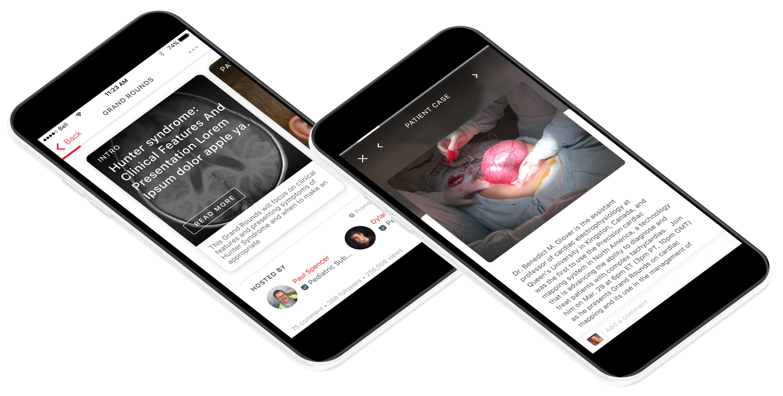
Main Problem
Our current design for our grand rounds didn’t look that special and visually looked similar to a any normal case. Our BD team wanted us to revamp it to make it more interactive and spark better discussions - while also adding in better functionality that was missing in the old version (ability to share, do quizzes etc)
“Old designs looked like regular cases”
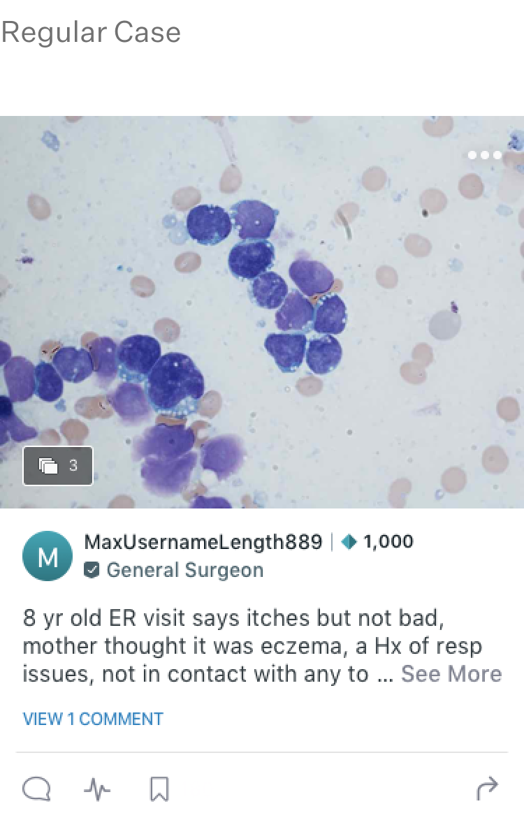

As mentioned before, the original design crafted 3 or so years prior, looked like a generic image case on our platform. Users had a had a hard time distinguishing it from a regular case. This also made it difficult for us to hold sponsored content within a grand rounds, as they would just blend in with every other case.
UPDATED DESIGNS

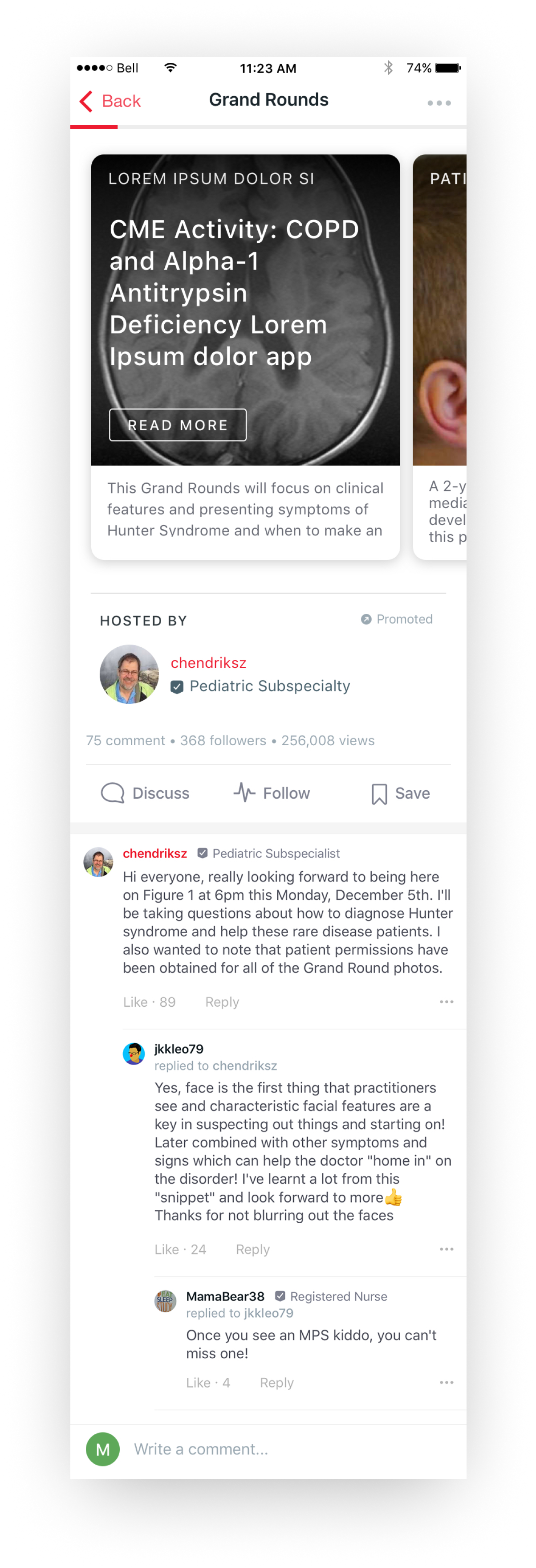
Improved visibility in feed with new
feed card
One idea to improve a grand rounds case in the feed and gain more clicks or views was to come up with a new visual feed card that would show a title of the new grand rounds a long with a brief description. We also by law had to show whether or not this content was sponsored, by using a sponsored tag icon that our viewers can see.
Introducing the “hub view”
Initial user interviews we had on the original design, showed us that some users wanted to quickly browse to the part of the grand rounds where they were themost curious. To help with this we decided to put users in a hub view before reading the actual content. This let them skim through the chapters of the grand rounds giving them the freedom to skip parts if necessary. The hub view was also where the main discussions on the grand rounds happened - with the author of the content highlighed.
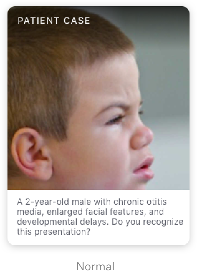

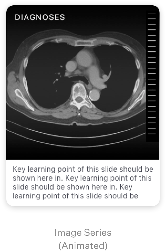
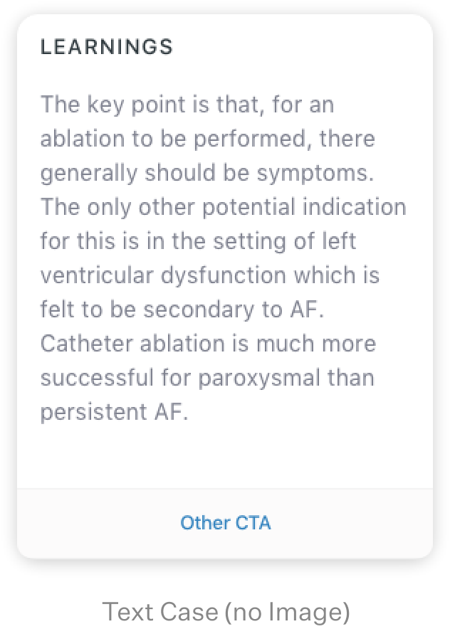
Hub View Cards with modular content types
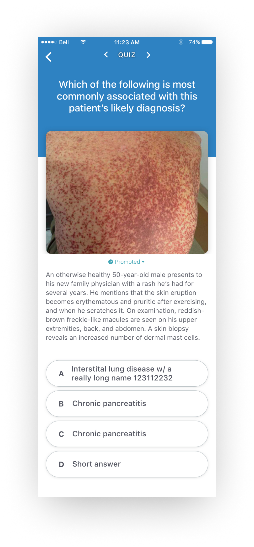
The hub cards themselves were modular, and we gave the author the ability to choose between a few different content types in order to make the grand rounds more appealing and interactive. Adding more content types was a BD incentive to help sell more grand rounds activites to clients as well.
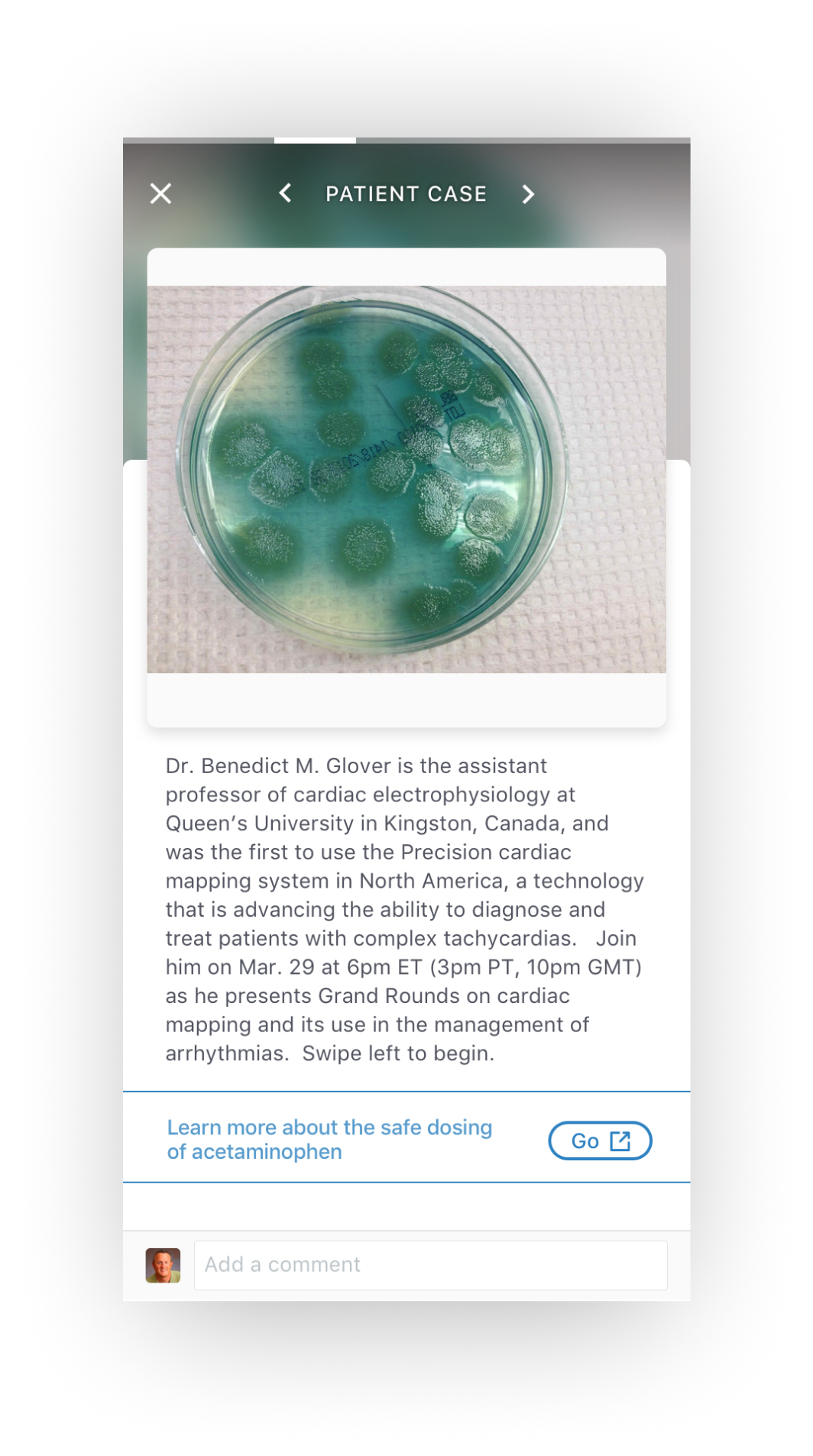
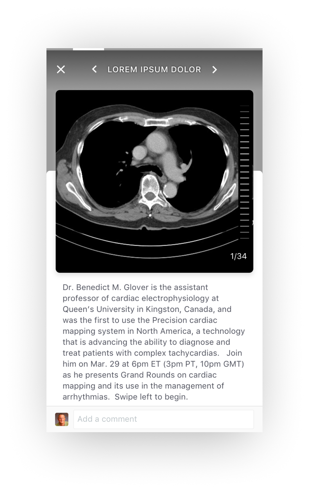
"Detail View" Cards to match new
content types
With the new content types added, we also had to update the actual pages that held this information, dubbed the “detail view”. Visually these didn’t change much when compared to the original design - but we did add some new functionality, like sponsored links to our client’s sites, quiz answers and a progress bar to see how far you are in the slides.
Interviewing users with an alternate “Long form design” Vs “The Hub View”
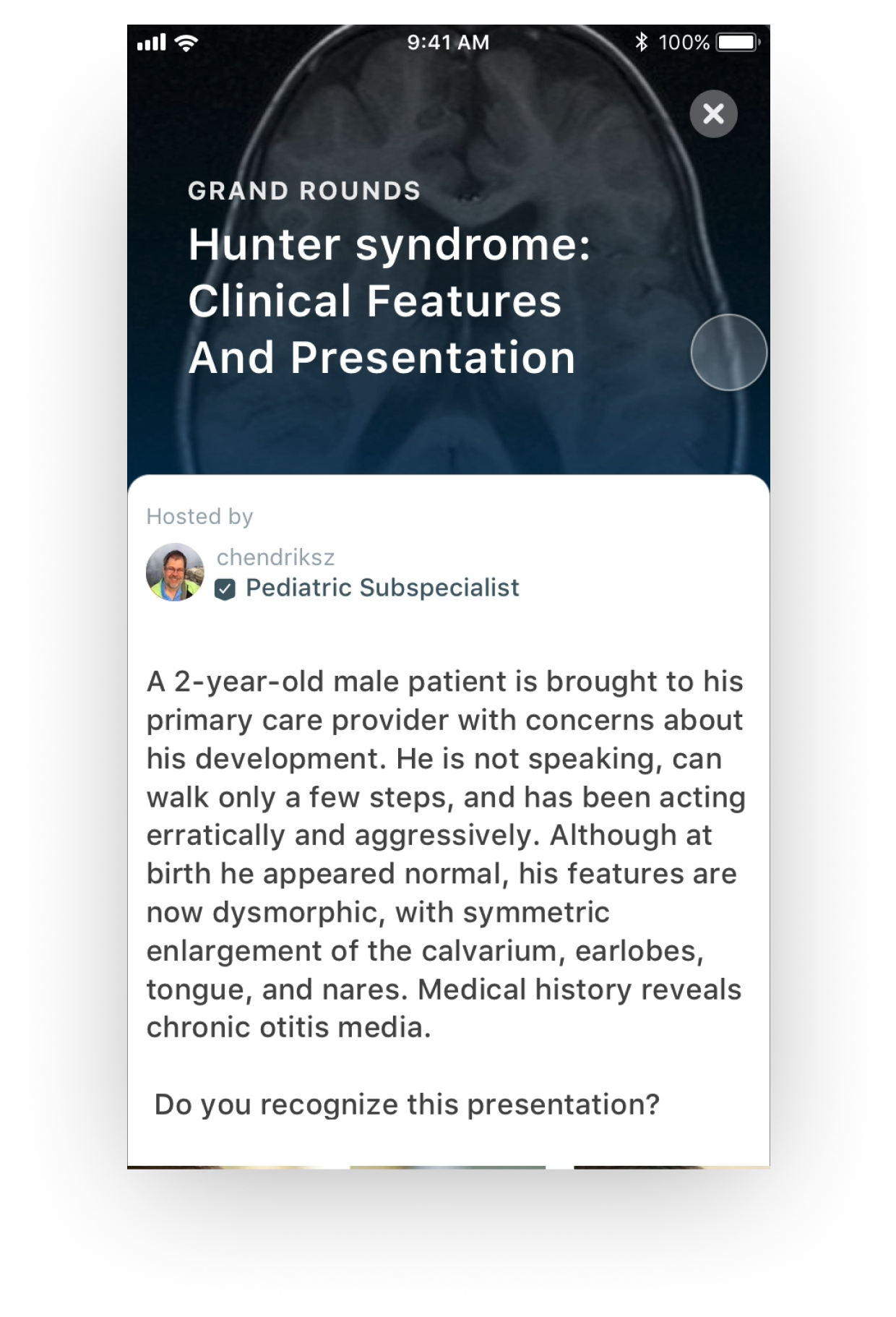
Old “Article style designs” didn’t do well in user testing.
The new designs were also meant to be bite sized and easily digestible for users.
In the early stages we created a more article style, long scrollable type of design but when we did user testing, users mentioned it felt like they were just reading a textbook.
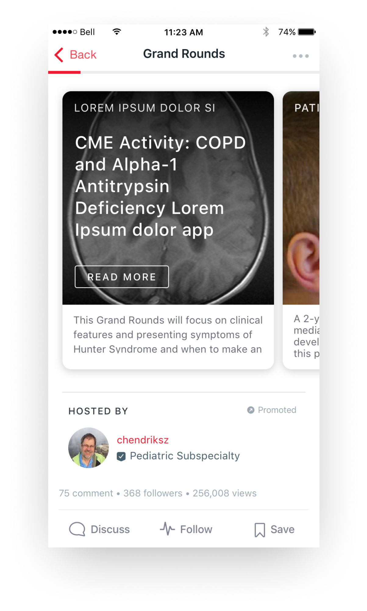
Users mention the visual aspect (images) as a really important driver to engage with content
Hub layout makes content easier to digest and skim
Layout feels more “approachable” in that you absorb the highlights at a glance and choose to learn more if you want
Don’t feel as obligated to read through the entire Grand Rounds
Lastly we had to come up with a quick
web version.
RILEY CO